GitHub’s UI is a complex system of actions, notes and complex meanings. As a result, we’ve leaned pretty hard on tooltips. Since the site first launched we used a tooltip plugin called tipsy.
Tipsy
Tipsy, now unmaintained, was a jQuery plugin to replicate Facebook’s tooltip styles. Back then it was simple to add to the site, we dropped it in, and kept it around for a while.
Last year I began to turn a  critical eye to tipsy. We were focusing on front-end performance and were trimming all excess javascript events. What I found was we were firing sometimes hundreds of
 mouseover & mouseout events on pages that had a lot of tooltips.
We knew then that we wanted to kill tipsy from our site, but the only hope we had was to make a fully CSS solution.
Hint.css
It was about this time that a library was released on GitHub. Hint.css, is ”..a tooltip library written in SASS which uses only HTML/CSS to create simple tooltips.” This was a very interesting development and perfect timing because we were considering a tooltip replacement. Hint promised to be everything we wanted.
We investigated and found that Hint.css is a very elegant solution, but didn’t match our tooltip style. More specifically, we wanted tooltips that centered on content.
Hint vs Tipsy
I didn’t want to have to redesign our tooltips or figure out how they fit on all the different places we scattered them. The fact that Hint.css, at the time, only showed tooltips from the top left or bottom left made using it a non-starter.
Primer.css tooltips
“I was tinkering around and found a way we can replace tipsy with all css tooltips. I’ve already seen a couple of downside and upsides, but I will create a pull request with the advantages and disadvantages here. We can have a thread on if we really want to do this or not.”
That’s how I started a pull request off where I had been working out a way to rebuild our tooltips with CSS. The breakthrough happened when I read about translateX which has pretty good browser support now. Translate calculates the position based on the object’s size. The difficulty before was, we don’t know how wide the tooltips are going to be. We can’t position them in the old fashion where we offset with margin-left: -50px;.
What we ended up with, was a hybrid of Hint and Tipsy.
Replacing 717 tooltips
I’m not exaggerating when I say I replaced 717 tooltips across our codebase. This didn’t happen in one big swoop. And it wasn’t released to non-staff for a few weeks.
The approach I took was to start out by making the new Primer tooltips and tipsy work side by side. To do this, I added a class to the body for all non-staff. tipsy-tooltips.
$.observe '.tipsy-tooltips .tooltipped',
  init:   ->
    el = $(this)
    el.attr('aria-label', el.attr('title')) unless el.attr('aria-label')
    el.tipsy {
      gravity: gravity
      title: 'aria-label'
    }
  add:    -> $(this).tipsy 'enable'
  remove: ->
    $(this).tipsy 'disable'
    $.fn.tipsy.revalidate()
Doing this would turn on tipsy tooltips for anyone who had the tipsy-tooltips class.
For GitHub staff, I had a conditional around the tooltip stylesheet bundle. Which would only add the css to the page if the user was staff.
<%= stylesheet_bundle 'tooltipped' if css_tooltips_enabled? %>
The strategy behind this was to give us the ability to find the bugs with the new system before shipping it to the public.
Advantages
There were going to be trade-offs in going from a JS based tooltip solution to a CSS based solution. I wanted to list the advantages and disadvantages to see if the benefits outweighed the trade-offs.
Performance
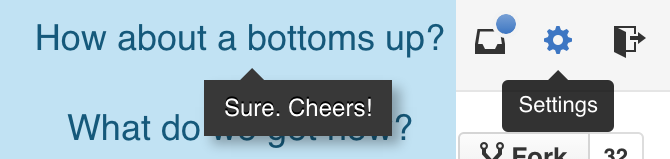
This was the first question in my head, because we’re doing a bunch of transformations and transitions with the css version it’s unclear that it’s really a win. But early diagnostics look good! Here’s the mouse hovering over the collapsed repository sidebar tipsy vs. primer css tooltips.
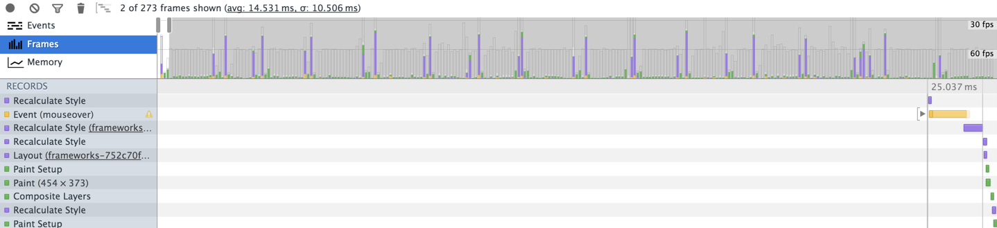
In the tipsy timeline, you can see at the top there are spikes that are shooting into the 30fps range. This causes jank hovering and scrolling on some of our larger pages.
Notice also the yellow bar that occurs at the beginning of the event waterfall. This is the time it takes for the JS mouseover event to fire and move the tooltip into position.
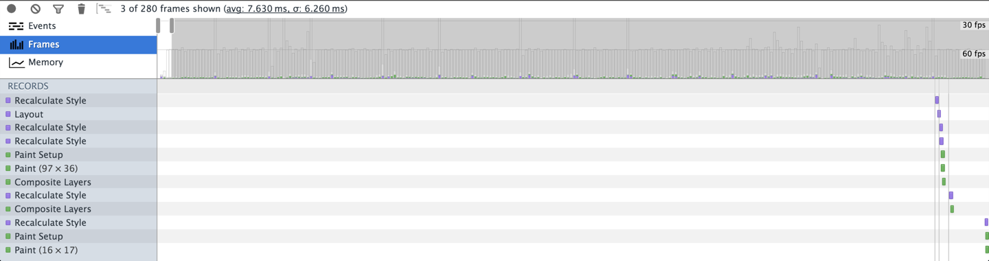
For comparison here is the Primer.css tooltip timeline. All of the actions remain in the 60fps  .
.
I was also looking into the paint rectangles that happen when tipsy was fired, versus primer.css tooltips.
Tipsy’s paint triangle was the whole screen. I believe because the tooltip is moved off screen and repositioned after every hover.
The fully css tooltips had very little screen repaints.
Flexibility
:focusThere was more flexibility with how and when we triggered the tooltips.
We could easily add :focus triggers for the tooltips without adding more js events to them.
Even adding transitions and delays to the tooltips. Delays could be useful if we didn’t want the tooltips to appear right away. Giving the UX a more natural feel.
Disadvantages
There were some disadvantages that caused us to rework some of our code.
Overflow hidden
This was one of the biggest trade-offs we had to overcome. There are many reasons you may want to use overflow: hidden; or scroll. We do this in our issue comments, and in a lot of places that traditional clearfix fixes won’t work.
The problem is the tooltips were no longer global elements in the DOM. They now existed right along side the element that was triggering the tooltip. When these elements were inside a container that had overflow:hidden; applied to it, you would get clipped content and not see the full tooltip or sometimes none of it.
With tipsy we didn’t have this problem, because tipsy creates a global tooltip that it reuses for every element. The global tooltip element lives at the bottom of the page, placing it safe from clipping.
:before, :after collisions
Anytime we used .tooltipped classes in conjunction with another class that used the :before, :after pseudo-selectors we had collisions. This meant that we couldn’t use the .tooltipped class with our octicons, clearfix or a few other minor places we used :before and :after.
We would get around this by separating these to separate elements.
title attributes
The way that tipsy worked was it used the already defined title= attribute on an element, grab the data within, destroy the title= attribute, then display the tooltip. This was how it got around displaying both the native tooltip and the tipsy tooltip.
That is a lot of logic that we couldn’t accomplish with pure CSS tooltips. We ended up using aria-label instead. Which would not display a native tooltip, but would add context for users with accessibility issues. “The aria-label attribute is used to define a string that labels the current element. Use it in cases where a text label is not visible on the screen.”
What seemed like a disadvantage turned out to be an advantage. Our site was now getting more accessible.
Going live
After all the bugs  were squashed, we decided that it was ready for everyone. Before shipping, we began tracking window performance with
 window.performance to see the results.
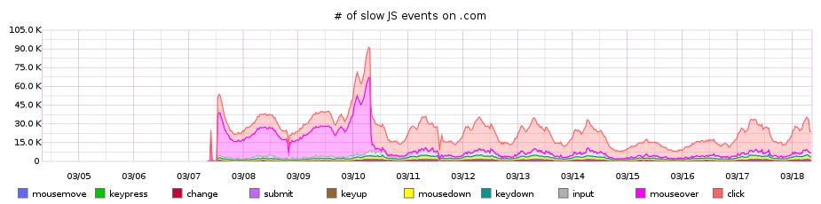
The graphs looked GREAT! When we turned on the css tooltips, slow mouseover js events went from around 30,000 an hour to almost 0.
Support for CSS3 2D Transforms
| IE | Firefox | Chrome | Safari | Android | iOS |
|---|---|---|---|---|---|
| 9+ | 3.5+ | 4+ | 3.1+ | 2.1+ | 3.2+ |